tantanbloom.com ELIE SAAB RUNWAY PARIS tantanbloom.com Jeff Leatham . Armani Prive Zuhair Murad Photo copyright George Burns / la Storia foto Jeff Leatham Roberto Cavalli . ROBERTO CAVALLI . . JEFF LEATHAM ELIE SAAB JEFF LEATHAM Rami Kadi . . Lazaro Bridal J. L. Valentino COLIN COWIE Zuhair Murad . Collin Cowie COLIN COWIE ZAC POSEN ALEXANDER MCQUEEN . Zuhair Murad . DOLCE AND GABBANA 2015 . tantabloom.com ZAC POSEN . ALEXANDER MCQUEEN . . BALENCIAGA . . . VINTAGE INSPIRED BOUQUET COLIN COWIE KAREN TRAN AUTUMN WEDDING OSCAR DE LA RENTA . ELIE SAAB COLIN COWIE, THE PLAZA HOTEL COLIN COWIE . ELIE SAAB FALL 2015 JEFF L. CHANEL JEFF LEATHAM ELIE SAAB . . Alexander McQueen ROBERTO CAVALLI . JUST CAVALLI JEFF LEATHAM
I get my inspiration from everywhere, either a dress, a painting or a sunset…. I hope any images here help you find yours, it only takes a little bit of imagination and always looking at things with the eyes of the soul instead of our physical, limited ones, limits that come from our minds and that are only imposed to ourselves by us … Imagination is limitless.
I believe images are powerful and inspiring, if we stop limiting our perceptions to the obvious, a world of possibilities and wonder lays ahead of us. Happy dreaming or happy traveling of the mind and a great weekend everyone. Thank you for stopping by!
Emmanuelle Beart. So beautiful! That would make an amazing wedding dress, wouldn’t it?Gorgeous!Jewel tones are exquisite..Baccarat… a million crystals of inspiration!Hotel de CrillonHotel Crillon, Paris.Hotel de CrillonColin Cowie. Beyond talented!.. He is definetly one of the best!Cate Blanchett in Giorgio Armani, magnificent!All the right combinations..Rosie HuntingtonColin Cowie, The Bridal CircleSummer dream...Everything pretty is the rule!.Hotel de Crillon.Spectacular shoes!Have you ever seen something more adorable?Vintage feel with old framesCamilla Belle, Jezebel magazineParis in bloom. Cherry blossoms!Like Ice candy!When words are absolutely unnecessary and redundant..Infinite possibilitiesLebanese designer Elie Saab presents his Spring/Summer 2011 Haute Couture collection at theTheatre de Chaillot during the Paris Fashion Week, in Paris, France, 26 January 2011. Photo by Nicolas Gouhier/ABACAPRESS.COMEugenia Silva for Armani, found at ru_glamour.livejournal.comCimbrone Gardens, Ravello, Italy…Villa CimbroneGold and Black, perfect.Black and GoldJust what I needed!Carolina Herrera. Such a class act, such a talent..Pink Powder…Elie Saab, timeless..Beautiful brideColin Cowie weddingsValentina Zelyaeva, Ralph Lauren.Ralph … always and forever…La vie en Rose ..Crystal inspiration from Baccarat, it’s a symphony for the senses!Colin CowieLittle Flower girlColin Cowie, he is amazingBy Studio B Floral, Burnsville. Founded in mnbride.comAlberta Ferretti, Pre Fall 2015. What is this doing here? I love the anticipations for things to come… in every single way!How beautiful is that?!…Art…George V Hotel, Paris.Oscar de la Renta..Ralph…Ralph Lauren. Now you can pick your color palette and get inspired with the elements and colors of one single dress!
Once again, enjoy your weekend and make it count! Intensity can be experienced in many unexpected ways!
Marsala is the color of the year… Well, even though I like this shade very much, to me it gets too close to Radiant Orchid, Pantone’s 2014 seleccion. Too close but not enough to be able to reuse the accessories of last year with the new shades or tints of the new one. To me last years Radiant Orchid was more in the cooler side, with blue undertones, this years Marsala is more in the warmer side, with earthy undertones like the wine from which it takes it’s name that comes from the surroundings of the Sicilian city of Marsala in Italy . (By the way, I don’t think there is anything in the colder side in Italy! Everything seems to be warm and intense!)
I love this, I’ve been a fan of lacquered walls and rich tones forever and that light fixture is awesome Pretty Woman memories
I don’t follow fashion or trends at all, I enjoy them but they don’t dictate anything in my world, unless I happen to fall in love with one of them. What I don’t understand is that they pick the colors too close to each other, in the same intensity…. I would rather have them pick something complementary or a tint or shade of the color, so regular people who follow these things can have a better opportunity to play with what they already have just adding the “new” color, creating richer environments with more layers and personality and cooler wardrobes . Well, I’m not color expert or anything close to that but for what is worth, this is my fifty cents in this matter 😉
Some hues are gorgeous like this Ives Saint Lauren clutch Carnival The colors of 2015 I’m a little afraid…. It’s still Marsala, right?
I’ve had many people asking me along the years why a particular color, even white, didn’t work with what they had at home or in their closet, when it seemed perfect at the store… Undertones! I won’t get into that, there are too many blogs and too many experts that already do that brilliantly, just trying to give one more reason why the experts at Pantone should pick something complementary or analogous, with the same or compatible undertones, that will work together and in that way make life simpler for people that don’t know much about the intricacies of color but they do know something is not working and they don’t know why! Probably I’m wrong but it’s just my humble opinion… Still, I think they should do that at least two years in a row…
These are gorgeous! They would make any woman feel like a queen. Marsala, how much I love thee! Seriously, I absolutely adore these colours here!
The title in this post is Fifty shades of … because I wrote another one called “The color Purple and it’s fifty shades” talking about last year’s pick. I’d like to put a link here but I have no idea how… it seems to me that I could reuse some of the images I used there… confusing!
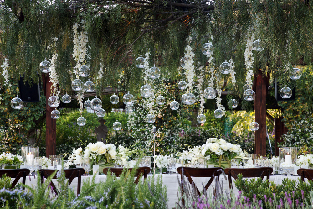
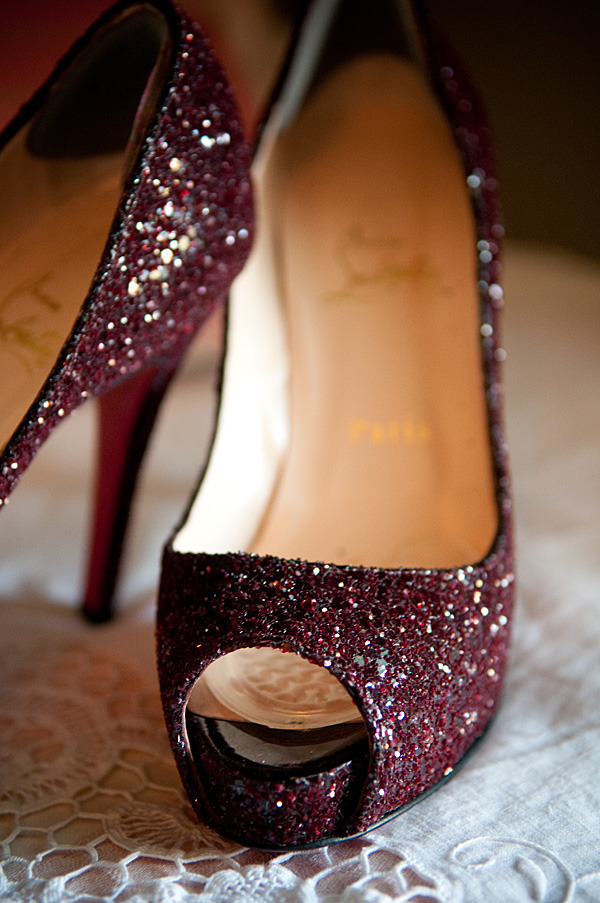
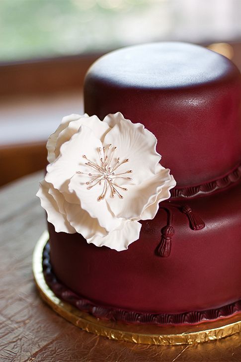
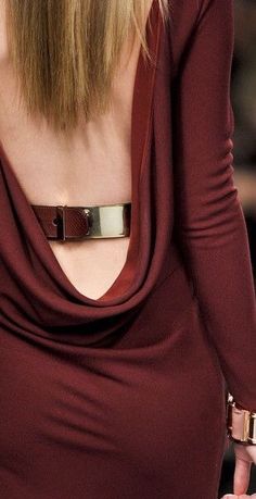
How sweet is this?! Soft and intense at the same time Vera Wang Marsala shoes Mark Rothko Mark Rothko Lacquered walls! Very rich Accent Without the shadow of a doubt.. Burberry love Marc Jacobs Just like drops of wine in the snow… Lovelies ! You prepare a table before me… Silence is golden and this is perfect! More Marsala with gold Starting with wine, ending in rose powder.. O.P. The new palette A vase full of colour So many dreams and hopes in a bundle… (Let’s assume the flowers are in some marsala shades and tones 😉 … we just can’t see!) Definitely warm undertones Olivia … must be so fun to dress like her! Not particularly this one…. More like this one! There will be cake! Scheherazade! One thousand and One nights! Rich wines tones,Valentino. I love the booties. There is something special about winter weddings… I think And there will be more cake !!!! Mark Rothko Nothing can compete with nature. It’s perfect! Talking about warmth! Delicioso! Say YES! to this dress!!! A magic carpet Pinch me to know I’m not dreaming! Candlelight, the best light after the sun! Very pretty Shoes…. No woman is immune to that! There is a time for everything, Marc Jacobs Elegance, Lucy in the sky, with diamonds…
Emma… Thinking about “The Help” one of my favorite books!
Wheels or wings? I pick wings.. Nature, makes everything feel obtainable! Burberry, I love you! Another one of my favorites! Hunter boots love. Loving this dress so much, I would only change the shoes More about Marsala, it should come with wine samples! Gorgeous Peonies! Weddings What a great combination, the softness of the skirt with the structured leather jacket..Perfect! Shoe Confidential… the power they hold… Olivia Palermo, in love with her closet … Wine Dreams… Chains of life… Burberry again Sofas are the best, so inviting.. Très chic With green? Accents make a big difference! she is so beautiful.. I find swimsuits and two pieces sexier and more attractive than tiny bikinis
Subtle and classy Cinderella shoes So fun! Marsala is the new black Sweet Carolyne (Roehm) Like a romance novel Marsala in a glance Warm palette in velvet and gold Flower guide
 I’M IN LOVE
 tantanbloom.com
 ELIE SAAB RUNWAY PARIS
 tantanbloom.com
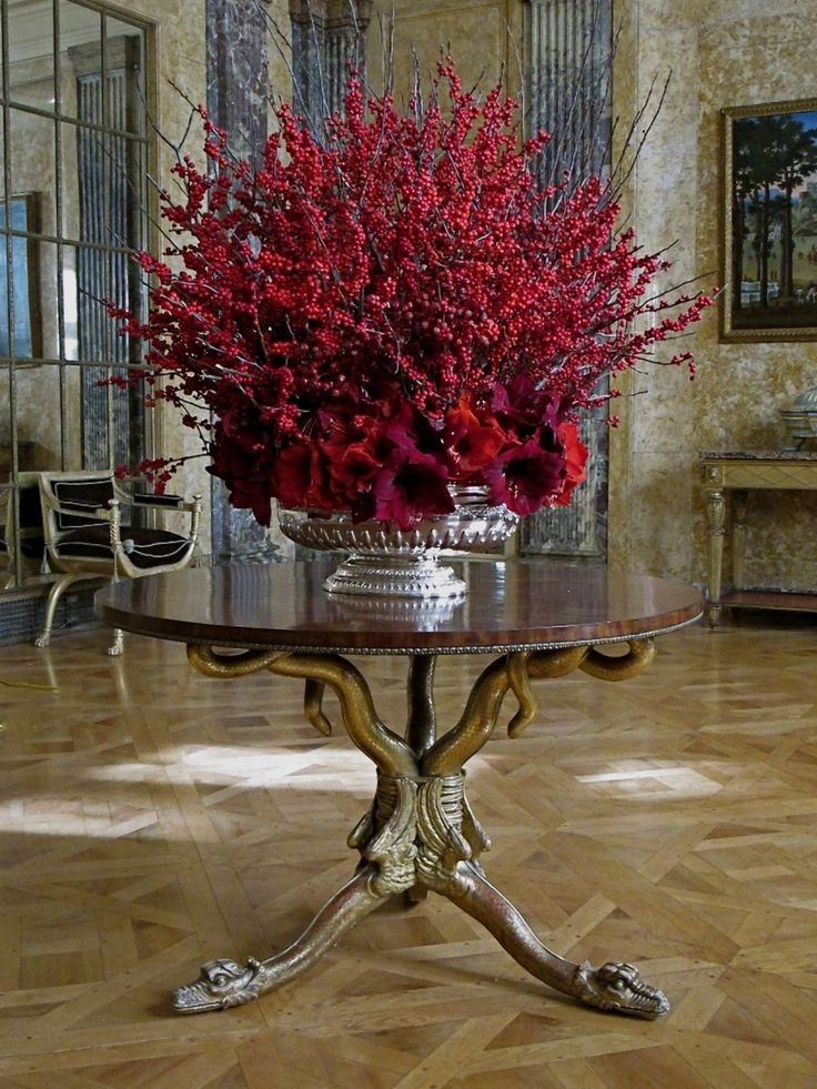
 Jeff Leatham
 .
. Armani Prive
 Zuhair Murad
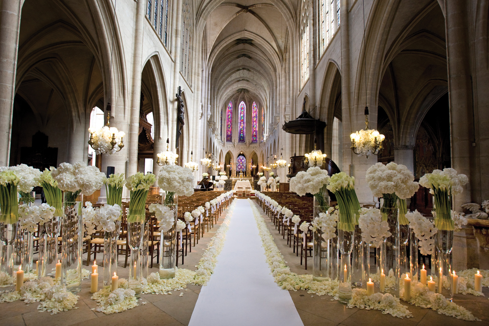 Photo copyright George Burns / la Storia foto Jeff Leatham
 Roberto Cavalli
 .
. ROBERTO CAVALLI
 .
. .
. JEFF LEATHAM
 ELIE SAAB
 JEFF LEATHAM
 Rami Kadi
 .
. .
. Lazaro Bridal
 J. L.
J. L. Valentino
 COLIN COWIE
 Zuhair Murad
 .
. Collin Cowie
 COLIN COWIE
 ZAC POSEN
 ALEXANDER MCQUEEN
 .
. Zuhair Murad
 .
. DOLCE AND GABBANA 2015
 .
. tantabloom.com
 ZAC POSEN
 .
. ALEXANDER MCQUEEN
 .
. .
. BALENCIAGA
 .
. .
. .
. VINTAGE INSPIRED BOUQUET
 COLIN COWIE
 KAREN TRAN
 AUTUMN WEDDING
 OSCAR DE LA RENTA
 .
. ELIE SAAB
 COLIN COWIE, THE PLAZA HOTEL
 COLIN COWIE
 .
. ELIE SAAB FALL 2015
 JEFF L.
 CHANEL
 JEFF LEATHAM
 ELIE SAAB
 .
. .
. Alexander McQueen
 ROBERTO CAVALLI
 .
. JUST CAVALLI
 JEFF LEATHAM